

Business Cards
Thick, premium cards that feel like the company they represent.
Business Cards & Corporate StationeryView Options →
The finish is the part of your card people feel before they read it. Here's what each one actually does.
The professional default: smooth, no glare, protects the card. Suits almost every brand.
Shiny and colour-popping. Works for bold, photographic designs; shows fingerprints more.
A suede-like matte that feels unmistakably premium. The most requested upgrade for client-facing roles — and the one people comment on.
Gloss varnish applied only to selected elements — logo, pattern, name — over a matt base. Subtle in the hand, striking in the light.
Metallic gold, silver or copper pressed into the card. One foil element, well placed, outperforms a busy design.
Raised elements you can feel. Best on thick stocks with minimal designs.
Match the finish to the hand-over moment: investor meetings favour velvet or foil; high-volume handouts favour matt. Tell us where the card will be used in your quote request and we'll recommend honestly.
→ Preparing Artwork for Print: Bleed, CMYK & Resolution
→ Brochure Sizes & Folds: A4, Tri-Fold, Bi-Fold Explained
→ From the blog: How to Choose Business Cards for Your Dubai Business
Thick, premium cards that feel like the company they represent.
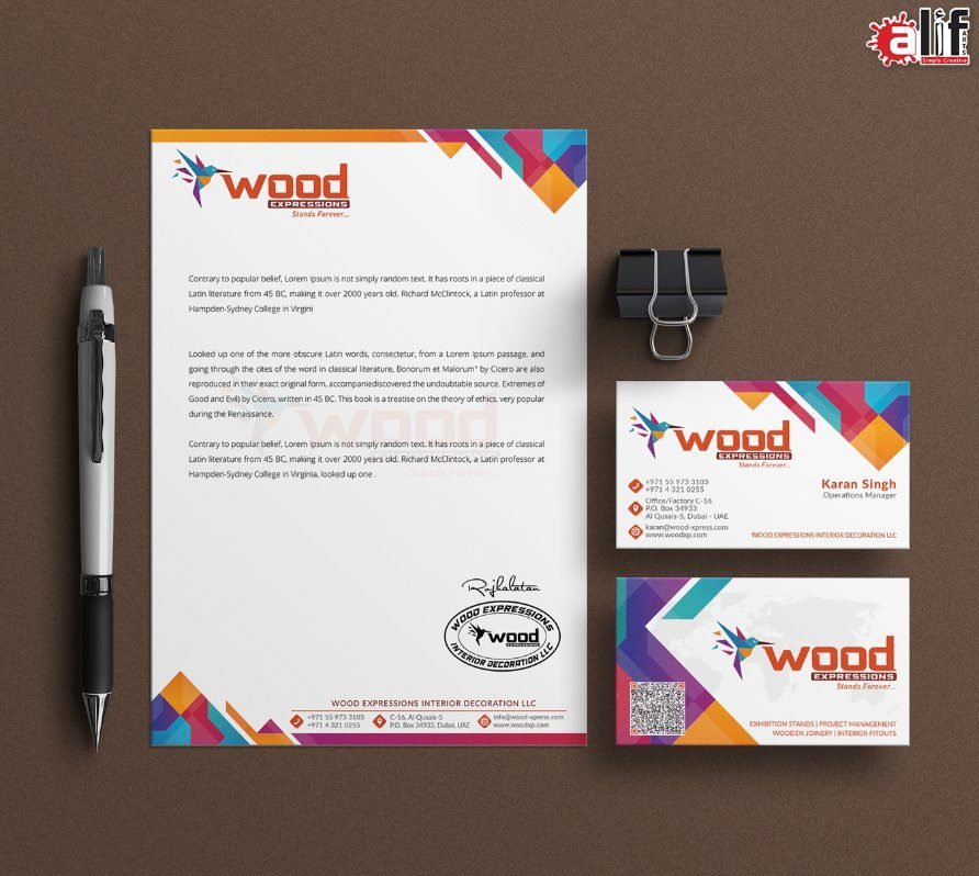
Letterheads, envelopes and sets that make a company look established.
Ready to print? Request a Quote Browse the catalog →

Tell us what you're printing — we'll confirm specifications, artwork and a clear quotation.