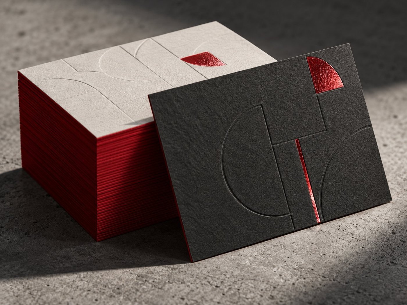
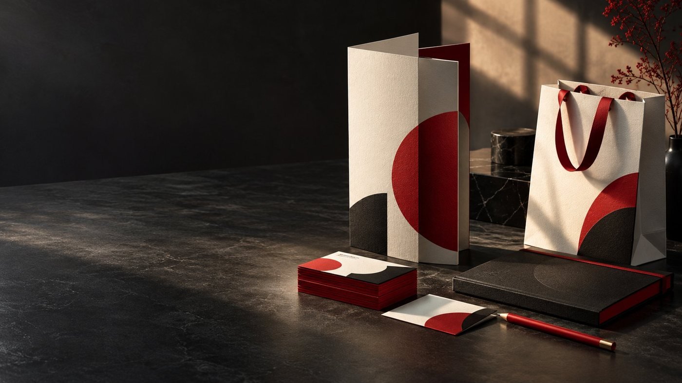
Think about how a customer in Dubai actually meets your business. They see your signboard driving past in Deira. A colleague hands them your business card. They check your Instagram before visiting, glance at a menu or a brochure in-store, and later receive an invoice or a paper bag with your name on it. Five different moments, five different formats — and your customer is quietly deciding, each time, whether this looks like the same, trustworthy business. That is what brand consistency does: it makes every encounter add up to one reputation.
What "consistent branding" actually means
Consistency is not about stamping your logo on everything. It is about a small set of visual rules being followed everywhere:
- One logo, used properly — the same version, never stretched, recoloured or placed on clashing backgrounds.
- A fixed colour palette — your brand colours specified once, then reproduced faithfully in print (CMYK) and on screen (RGB/HEX values).
- Set typography — one or two typefaces used for headings and text across cards, brochures, signage and social posts.
- A recognisable style of imagery and layout — similar photo treatment, spacing and tone, so pieces from different months still look related.
- The same name and details everywhere — identical business name spelling, phone number and handles on print, Google and social profiles.
Why it matters commercially
Recognition. People buy from businesses they recognise. When your flyer, your shopfront and your Instagram grid share one look, each exposure reinforces the others instead of starting from zero.
Trust. Mismatched materials — an old logo on the signboard, different colours on the menu, a blurry logo on the invoice — read as carelessness, even when the underlying service is excellent. Consistent materials signal an organised, established business.
Faster decisions. Consistent design is easier to produce. With set colours, fonts and templates, a new flyer or social post takes minutes to brief instead of starting from a blank page, and any designer or printer can continue the system.
Print quality. Print exposes inconsistency mercilessly: a logo file that is "close enough" on a phone screen becomes visibly wrong at signboard size. A tidy brand file set (proper vector logo, colour values, fonts) is what makes reprints match the originals.

The print–digital gap (and how to close it)
The most common inconsistency is between screen and paper. A brand colour chosen on a monitor will print differently in CMYK unless it was specified for both. The practical fix is a one-page brand reference that records: the logo files (vector for print, PNG for digital), colour values in CMYK, RGB and HEX, the fonts, and any rules such as minimum logo size or clear space. With that single page, your printer, your social media designer and your web developer all produce matching work. If you do not have one, creating it is a small project — it is a standard part of our logo design and brand identity service.
A 15-minute brand audit you can run today
- Lay out (physically or on screen) your business card, one flyer or menu, your signboard photo, and your Instagram profile side by side.
- Check the logo: is it the identical version everywhere? Is any copy stretched, pixelated or in the wrong colours?
- Check colours: do the same two or three brand colours dominate each piece?
- Check fonts: would a stranger group these pieces as one business?
- Check details: same business name spelling, same phone number, same social handles on every item?
- Note the worst offender — usually the oldest piece — and prioritise reprinting or updating that one first.
Where to apply consistency first
Start with the items customers handle most: business cards and matching office stationery, your signage, and your highest-volume marketing piece (menus for restaurants, brochures for services, packaging for retail). Social templates can follow the same system so your feed and your print tell one story. You do not need to reprint everything at once — replace pieces as they run out, using the corrected brand files, and within one reorder cycle the whole set aligns.
Do not forget the two profiles customers check before they ever touch your print: your Google Business Profile and your WhatsApp. The same logo, the same business name and the same phone number should appear there as on your cards and signage — when a customer saves your number from a flyer and your WhatsApp shows a different name or an old logo, a small doubt is planted at exactly the wrong moment.
The bottom line
Consistent branding is not a luxury reserved for large companies; for a small Dubai business it is one of the cheapest forms of credibility available, because it mostly costs attention rather than money. One logo, one palette, one set of details — repeated calmly across print and digital. If your audit turns up mismatches you would like fixed, send us photos of your current materials and we will suggest the most practical order to bring them into line.
Have a project in mind?
Tell us what you are planning — specifications, materials and artwork are confirmed with you before production, because every project is different.